
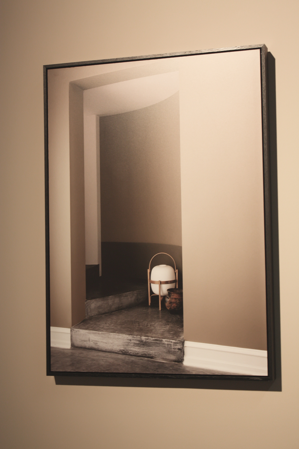
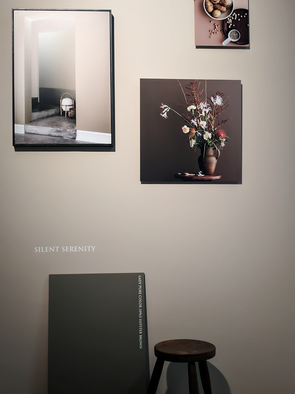
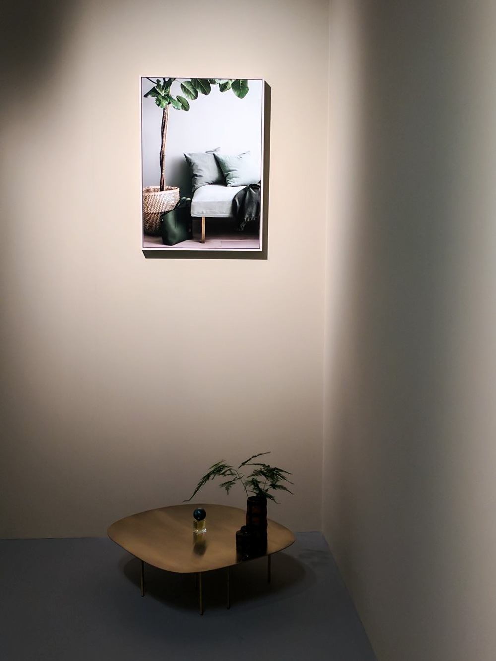
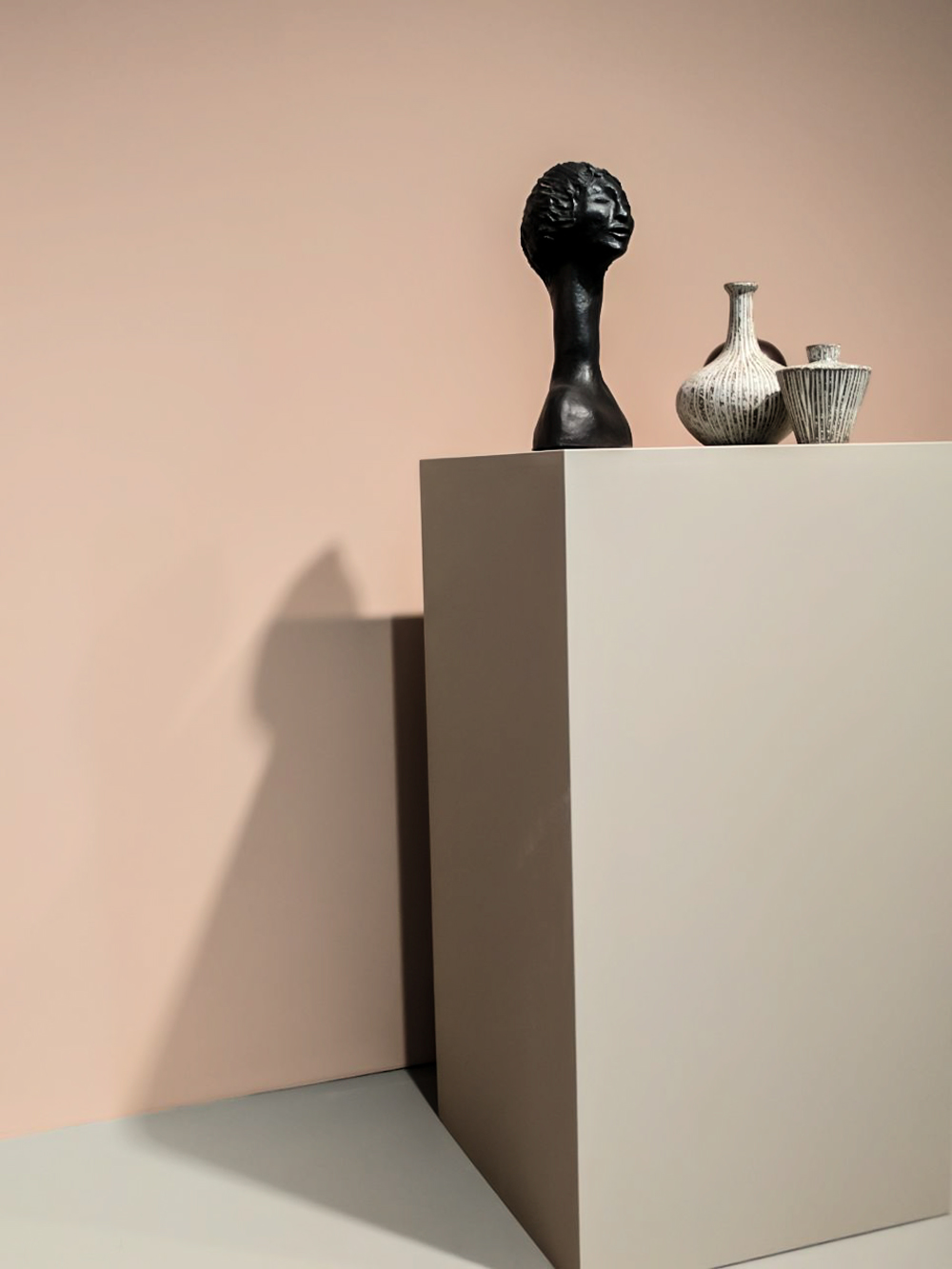
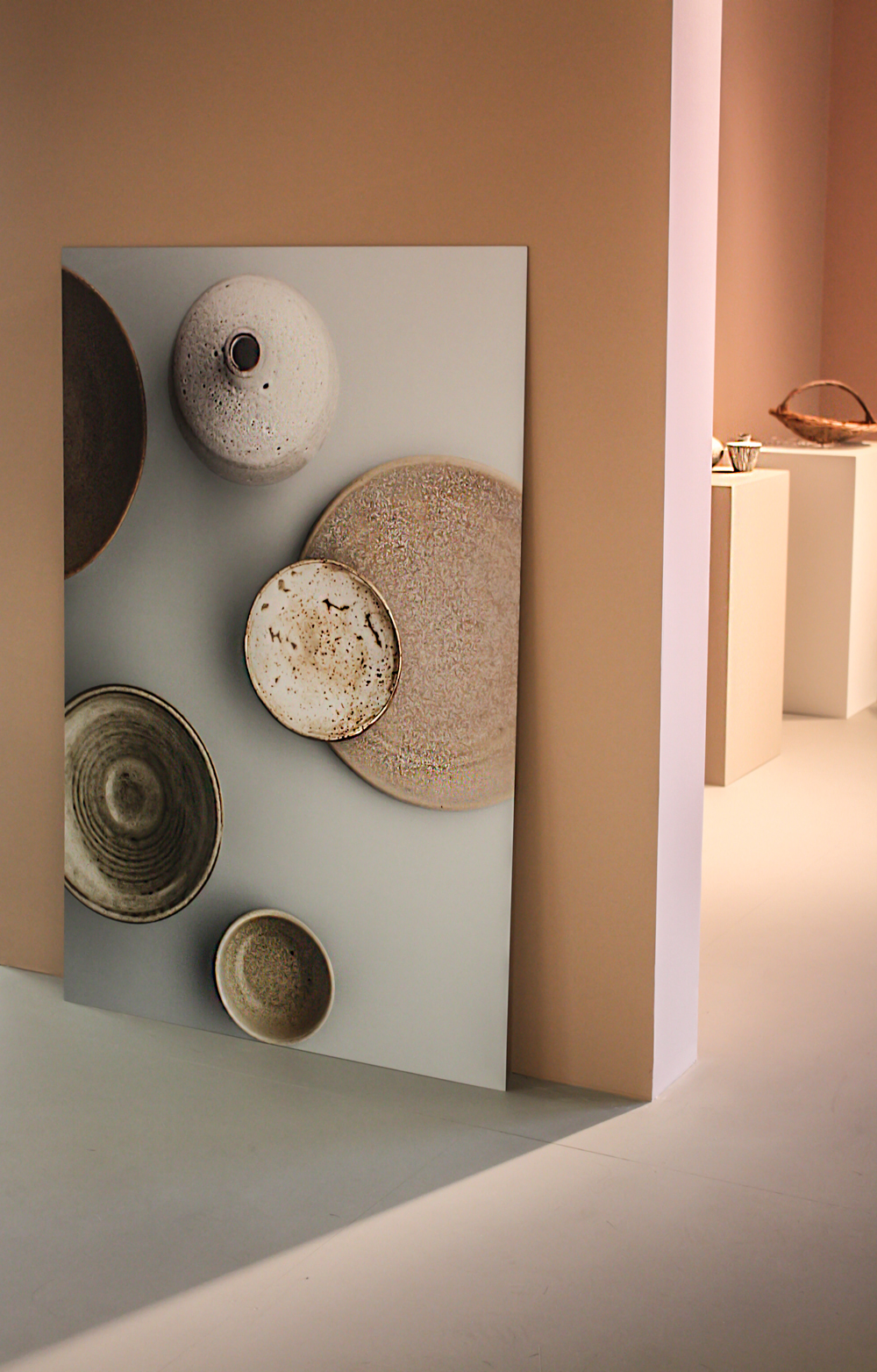
The latest visit to the Nordic Design Fair Formex in Stockholm brought so much inspiration, trend finds and interesting contacts. I would say that Formex has one of the calmest atmospheres I have ever experienced in a fair. Well, at least it is how I experienced it. Despite the overall calm atmosphere, there is a lot of energy boiling when you walk from one stand to another, diving by each stand into a different design world. As I walked out to the Gallery section I suddenly found a true place of serenity. I walked into the exhibition of the Norwegian company Jotun who presented the current wall color trends in Nordic Design and their Lady Color Chart 2018. It was like entering a beautiful art gallery. Standing here reminded me what a powerful effect a harmonious use of color can have on our senses. Behind the beautiful presentation of the harmonious use of color by Jotun stands an impressive amount of research, styling work by Norwegian duo Kråkvik & D´Orazio, photography by Danish Line Klein. Among beautiful art objects that complimented the wall colours where also the framed prints of the inspiring look book images featuring the home of Danish architect Jonas Bjerre Poulsen from Norm Architects.
This year’s colour palette consists of three themes:
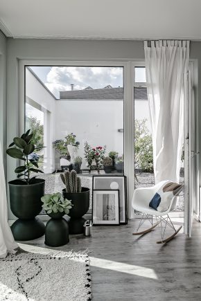
• Silent Serenity for creating a warm atmosphere of mindfulness with light hues of earthy and sand, muted peach, almond, soothing cream and soft pink.
• Lush Garden inspired by the botanical trend and featuring hues of green with their restorative calming features, inspiring us to connect to nature and create a peaceful botanical sanctuary at home.
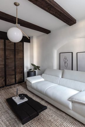
• City Motions, represents modern urban lifestyle, with a sophisticated, minimalist and industrial aesthetics. This colour palette of blue nuances, marble greys and wooden hues of brown.
Even though I like all the elements, I would say I am probably the city motions theme type. And what color theme speaks to you the most?
I will let the images from the gallery speak for them selves now:
Aktuelle Wandfarben-Trends im Nordic Design
Der letzte Besuch der Nordic Design Messe Formex in Stockholm brachte so viel Inspiration, Trendfunde und interessante Kontakte mit sich. Ich würde sagen, dass Formex eine der ruhigsten Atmosphären hat, die ich jemals auf einer Messe erlebt habe. Nun, zumindest habe ich es so empfunden.
Trotz der insgesamt ruhigen Atmosphäre ist es ein wenig überwältigend, wenn man von einem Stand zum nächsten geht und an jedem Stand in eine andere Designwelt eintaucht. Als ich aus den Messehallen zur Galerieabteilung ging, fand ich plötzlich einen wahren Ort der Gelassenheit. Es war die Ausstellung der norwegischen Firma Jotun, die ihr Lady Color Chart 2018 präsentierte. Es war, als betrete man eine schöne Kunstgalerie. Ich stand hier und erinnerte mich daran, was für eine kraftvolle Wirkung eine harmonische Verwendung der Farbe auf unsere Sinne haben kann. Hinter der wunderschönen Präsentation des harmonischen Farbtrends von Jotun steckt eine beeindruckende Menge an Forschungsarbeit der Jotun Experten, Stylingarbeiten des norwegischen Duos Kråkvik & D’Orazio, sowie Fotografien der dänischen Linie Klein. Unter den schönen Kunstobjekten, die die Wandfarben ergänzten, wurden auch die gerahmten Drucke der inspirierende Lookbook-Bilder mit dem Haus des dänischen Architekten Jonas Bjerre Poulsen von Norm Architects als Hintergrund präsentiert.
Die diesjährige Farbpalette besteht aus drei Themen:
• Silent Serenity, für die Schaffung einer warmen Atmosphäre der Achtsamkeit mit hellen Farben von erdigen und Sand-Farbtönen, gedämpften Pfirsich, Mandel, beruhigende Creme und zartrosa.
• Lush Garten, der vom botanischen Trend inspiriert ist und Grüntöne mit seinen erholsamen Beruhigungsmerkmalen zeigt, die uns inspirieren, sich mit der Natur zu verbinden und ein friedliches botanisches Paradis zu Hause zu schaffen.
• City Motions, repräsentiert modernen urbanen Lebensstil mit einer raffinierten, minimalistischen und industriellen Ästhetik. Diese Farbpalette besteht aus blauen Nuancen, Marmor-Grau und Holztönen in braun.
Auch wenn ich alle Elemente wunderschön finde, würde ich sagen, dass ich wahrscheinlich der Motivtyp City Motions bin. Und welches Farbthema spricht Euch am meisten an?
Ich werde die Bilder der Galerie jetzt für sich selbst sprechen lassen:


Photography by Valerie Schoeneich / made at Formex17 Fair Stockholm